Oh dear, so much for my resolution to blog more regularly. Never mind, I will go for quality not quantity. I have been excitedly looking forward to starting my on line design course, and it began this past weekend - Liz took pity on us all gagging to get going and posted the class notes early.
The first unit looks at lines and shapes (elements) and balance (principle). If you had asked me last week what is more interesting, lines or shapes, I would have immediately said shapes – well of course!! But having taken some time to create different lines, to look for lines in the landscape – both natural and man-made - and thinking about lines – what we use them for, what meaning do they convey etc. I have decided that lines are pretty interesting all on their own.
Liz kicked off by repeating an observation she had heard that line is the least used element by art quilters. I am still thinking about that. Although I immediately thought of an exception –
Dianne Firth, Canberra-based quilter who is a master of using line in landscape abstractions.
We started off doing the sort of different line studies that I am sure you are familiar with if you have any books on design – these were done quickly, using Photoshop and my graphics tablet – feel more comfortable with that than a pen or pencil, besides which I didn’t have a chisel pointed marker, which we were supposed to use.


Then I followed Liz’s advice to pay attention to the world around me and took my digital camera on my lunchtime walks and found an amazing array of ‘lines’. That made me start to think about lines. I started thinking of so many different types of lines and uses of line imagery in our speech that I did a mind map:

click to enlarge. I was surprised to find how many types of lines there are in our world – literal and figurative.
There are real lines – telephone lines, pipelines, railway lines, production lines, power lines, even fishing lines and clothes lines - that serve a useful purpose and make our lives easier. Then there are the ‘imaginary’ lines that help us make sense of the world. Lines are fundamental to the way we perceive our world – think of the horizon line.
Seeing it skewed immediately produces a visceral reaction (literally making us feel sea sick). Our instinctive reaction to the second picture is to tilt our head to try and view the horizon line as a horizontal. We divide our world with lines – the lines of latitude and longitude; the line around the centre of the earth that divides north from south (although technically, these lines are in fact shapes, as they join up to form a circle), the north south line in the Pacific that determines where one day ends and another begins. We superimpose contour lines to try and make sense of our weather and the very ground beneath our feet.

Our days are ruled by lines – deadlines, timelines, guidelines.
We use them to delineate space – to point out where we may go and keep us on track


or where we cannot go
We use them to show the way and to create order they can help keep us safe


In the built environment they are often straight and strong and provide structure and strength

Things lined up look orderly. 'Stepping out of line' denotes rebellion, dissent, lack of co-operation – although visually, one element slightly out of line with the others looks much more interesting.


My absolute favourite discovery is ‘desire lines’. These are lines created in a landscape by people (or animals) walking a particular way. In the old days, these well worn track eventually developed into formal roads and routes – hence the higgledy piggeldy routes of laneways and roads in medieval towns. In the modern world, in the built environment, a desire line emerges when the landscape designer makes pathways take a certain route, but the people using the space decide otherwise. I like the notion of people ‘voting with their feet’ and silently rebelling against a structure being forced onto them that doesn’t suit their needs. There is probably a whole series of quilts in there – formal structures overlaid with slightly haphazard, organic lines that refuse to submit to the underlying structures. I’ll have to go away and make some notes and drawings in my notebook.
Yes, I have a notebook – at last. This course makes me keep one, and a good thing too.

And let's not forget nature - she creates a whole set of her own lines -usually much more organic than the regimented ones that man uses to try and impose order. I will have to find more examples of natural lines to add to my image collection - these just reflect what are in my immediate surroundings at home and work.
We also looked at the design principle of Balance this week. Personally I have always found formal symmetrical balance to be incredibly dull and boring – might be okay in classic
Greek buildings, but in quilts and textiles, I find it a big yawn. That is probably why I love scrap quilts – a barely contained riot of colour and shapes. The idea of making a whole quilt using the same block over and over and over and over again……………..hardly bears thinking about.
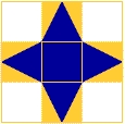
So asymmetry is definitely my preferred way to work. And I paid attention to radial balance,
which I probably haven’t taken a lot of notice of before. We had to do our exercises on 4” x 6” cards – I found that radial balance didn’t look right in the rectangular format – it seems to look
better in a square format.
Normally I would shy away from making a quilt or anything much in a square format, I suppose because I particularly like landscapes and they just don’t work in squares. But I can see now that if I HAD to work in a square format, then doing a piece with radial balance would work really well.
So, that is week 1. We are on to colour next week – yippee!!


