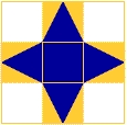
I am continuing - slowly - to work my way through my Photoshop course. I am looking forward to doing Liz Berg's online design class, which starts on 21 Jan, and in preparation was going through some of the abstract design exercises in recent editions of Quilting Arts magazine. Combined with this was the spooky experience of second guessing Sharon Bs colour scheme for her Take it further challenge, and it all came together in a session playing in Photoshop.
I decided to use the colour scheme chosen by Sharon for the TIF challenge and playing with it using simple shapes in PS. You can replicate the colours from Sharon's sample exactly by typing in the number at the top left hand side of each colour into the # box in the colour picker window of PS (to open the colour picker, just click on the foreground colour square towards the bottom of the main toolbar). Then create a document with a shape for each colour and save it as your reference. When you want to do some design work, or just play around seeing the effect of using different proportions of the colours in a design, open a new document and have your original which has a sample of each colour open alongside. Use the eye dropper tool to touch the colour you want from the original and that will set the foreground colour in your colour picker to that colour. Then just play with whichever tool you want to create shapes and fill them with the desired colour/s.
Here I just used the rectangular and ellipse marquee tools to create shapes in the different colours, on a textured background. No great design principles at play here!

Next I had a go at creating unity through proximity.

In this one I wanted to create a sense of movement, with the triangular shapes falling across the page. I also played with transparency with the pale yellow overlays. You can do this by varying the opacity.

The very first image I made using the rectangular marquee tool, then hit it with a filter to distort the shapes and make them more organic - I also used a gradient filter for the background. BTW all of this can be done even if you only have Photoshop elements (I tried it on version 2, which is pretty old!). I don't know why, but I feel more comfortable doing these sort of design exercises on the computer, rather than with real fabric bits. I guess I don't feel that I am 'wasting' fabricd - and I can always hit the 'undo' button. I also don't flatter myself that any of these are great examples of design! But as I said in my New Year's Eve post, I am resolved to follow Rayna Gillman's advice to accept the crap quota - so the more I do, the better I will get.
DISCLAIMER: Warning - playing in Photoshop can be a serious timewaster - don't blame me if you don't get the laundry done and dinner is late!


1 comment:
These are nice design exercises. And no fabric wasted!
Post a Comment